

Imagine inviting someone into your home for the first time.
Before they sit down. Before they say a word. Before you explain anything.
They’ve already decided how they feel.
They notice whether the space feels calm or chaotic. Whether it feels intentional or improvised. Whether they feel welcome or unsure where to stand.
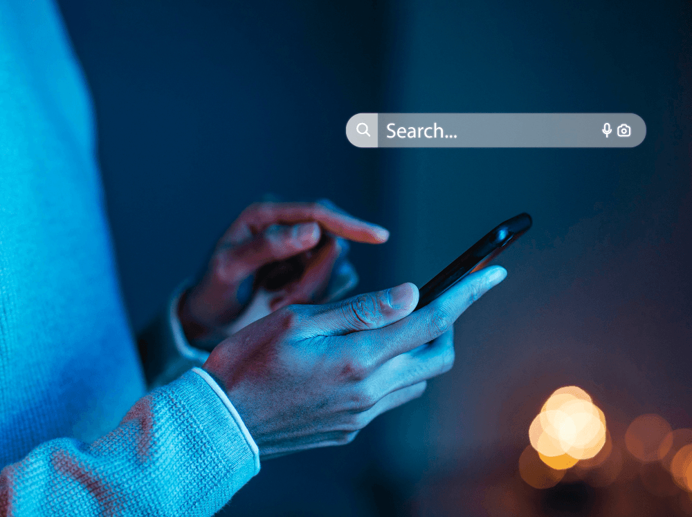
Your website works the exact same way.
Most business owners think of their website as a page or a tool. In reality, it’s a home. And every visitor is silently asking the same question the moment they arrive.
Do I belong here?
Your Website Is Not a Page. It’s a Home
When someone enters a well-designed home, they don’t need instructions.
They intuitively know where to go.
The entryway feels open.
The layout makes sense.
The space feels considered.
A great website does this digitally.
It guides people without forcing them. It creates comfort before conversion. It removes friction before logic ever kicks in. People do not analyze first. They feel first.
And feeling safe, oriented, and confident is what keeps them inside.
The Messy House Problem
Now imagine the opposite.
You open the door and immediately notice clutter.
Every wall is a different color.
Furniture feels randomly placed.
Nothing is broken, but nothing feels right either.
You wouldn’t say anything out loud.
You’d just want to leave.
This is what happens when a website has too many fonts, inconsistent colors, mixed messaging, and unclear priorities. Visitors may not consciously identify the problem, but their brain does.
They assume:
- This business is unclear
- This experience might be frustrating
- I should not spend time here
And they leave.
Not because your offer is bad.
Because the environment didn’t feel trustworthy.
The Awkward Walkthrough
Some homes make you uncomfortable because you don’t know where to go.
Do you take your shoes off?
Do you sit?
Do you wait?
Websites do this all the time.
Too many buttons. Too many calls to action. Too many competing messages.
Visitors hesitate. Hesitation kills momentum.
A well-designed website makes the next step obvious. One path. One direction. One clear invitation.
Anything else feels like confusion disguised as choice.
Why Great Design Feels Expensive
Walk into a thoughtfully designed home and you can feel the investment.
Not because it’s flashy.
Because it’s intentional.
Good design signals care, competence, and confidence. That signal transfers directly to how people perceive your value.
If your website feels cheap, your offer will always feel expensive.
This is not about aesthetics. It’s about trust.
People decide whether they believe in you long before they read your copy or understand your service.
A Website Is a Living Ecosystem
A home is never truly finished.
It’s cleaned.
Adjusted.
Improved.
Maintained.
Your website works the same way.
It’s not a one-time project. It’s a living ecosystem that reflects how your business thinks, moves, and evolves. When businesses treat websites as static, they decay. When they treat them as systems, they compound.
Structure creates freedom. Clarity creates momentum.
What a Well-Designed Website Actually Does
A great website doesn’t shout.
It reassures.
It answers questions before they’re asked.
It reduces anxiety.
It prepares people to say yes before the conversation even begins.
It is not decoration.
It is infrastructure.
And when done right, it becomes one of the most valuable assets your business owns.
So Ask Yourself
If your website were a home, would you proudly invite customers inside?
Or would you apologize for the mess?
Because online, just like in real life, first impressions don’t ask for permission. They simply decide.